
It’s Spring, and time to freshen up your presentation’s look and feel. I’ve recently discovered a presentation blogger named Craig Hadden. His blog is Remote Possibilities and it is worth reading. His post from December had three excellent suggestions to give your presentation an updated feel, something many of our clients are looking to achieve.
What does the term “modern-looking presentation” mean to you? If you asked a group of people that question, I’m sure you’d get a wide range of answers. But I’m also sure there’d be some common themes.
Here are 3 essential tips to make your slides look fresh and up-to-date. In fact, these ideas can make your entire presentation both look and feel much more modern to your audience.
Tip #1: Go Social
The #1 path to a more modern presentation is to embrace your audience’s need for social and mobile access.
You can go social in 3 steps, listed here from easiest to hardest:
- Easy: Don’t ask your audience to put down their mobile phones! Actually, quite the opposite – tell them you’d love it if they continue the conversation with you on Twitter. And let them know they’re welcome to ask you questions via Twitter (for you to answer later), or to share links (or their viewpoint) with you online.
By doing that, you’ll make your talk feel far more modern, and you’ll distance it from people’s memories of school, where they were probably lectured at. Rather than being an aloof expert, be part of a conversation among peers.
- Medium: On every slide, add your Twitter ID (not your company logo, which is impersonal and feels outdated), so your audience can tweet about your presentation while you speak.
On most slides, I suggest you show your Twitter ID (username) with fairly low contrast (say in grey text on a black background). On a few slides (each of which conveys a key point), show it in high contrast (for example, white text on a black background).
In this way, you get four benefits:
- Your Twitter ID is visible whenever you’re showing a slide, so people can tweet about your message (or share a photo of your content) anytime.
- The black background will look like part of the screen background, rather than part of your slides. So, your Twitter ID won’t detract much from your content.
- By highlighting your Twitter ID on some slides, you subtly suggest to your audience that those ones are most worth tweeting.
- By using this and other techniques to vary both your slides and the way you present, you meet people’s need for variety, which helps keep them engaged.
For example, here’s a slide where I used low contrast for the Twitter ID (by choosing a medium shade from the photo) because the slide is not a key part of my message:

And here’s a modified version of the slide, using high contrast for the Twitter ID (white text on a black background) because the slide shows the PACE model, which is part of my intellectual property:

- Hardest: Go all out by using 1 or 2 mobile apps, to completely engage your audience. For instance, you can let people answer a poll from their phone through an app such as Poll Everywhere. Or, with a free app like Crowd Mics, audience members can turn their phone into a wireless microphone (via wi-fi) so everyone can hear them ask a question during your Q&A. (Thanks to @KathyReiff for the Crowd Mics tip.)
In 2009, renowned presentation blogger Olivia Mitchell wrote a fab and free 60-page e-book called How to present with Twitter (and other back channels). Although much has changed in the years since then, that book is still a goldmine of links and references. Check it out!
Tip #2: Cut Content
After you go social, the second-best way to make your talk seem modern is to show less slide content.
Spread your content over more slides
Note that I didn’t say to limit the number of slides you use. In fact, you’ll likely want to spread your content over more slides than most speakers, so none of your slides overwhelm your audience.
For instance, suppose a typical presenter uses 30 slides with an average of 50 words each, making a total of 1500 words. To present for the same length of time, you might use 50 slides with an average of 10 words each, giving a total of 500 words. (To see some examples, see these 2 slides, which each have just 6 words on them.)
Here are my 3 favorite ways to cut content:
- Have just one idea per slide. For instance, I recommend you include no more than 15 words on a slide. (Given that you’ll probably speak for at least a minute about each slide, and you likely speak at more than 150 words per minute, you’re still giving your audience plenty of words to deal with.)
- Use full-screen photos on many of your slides.This gives you three benefits:
- You tend to put fewer words over photos than you would on a plain slide.
- Making your slide eye-catching means it’s more likely to be shared on social media (which ties in with top tip #1, above).
- Many presenters don’t use full-screen photos – and professional designers often do – so you’ll come across as fresher and more up-to-date.
- Turn off your slide periodically, by making the screen black so that the focus is on you alone. This uncommon technique will really make you stand out.
Tip #3: Use Color Well
This final tip is somewhat subjective, so you might find it’s hard to judge whether you’ve mastered it. As author Scott Schwertly puts it on the Slideshare bog:
“It’s easy to know when color combinations don’t look good,
but tougher to figure out what actually works”
Color is vital to make your slides look modern, because it’s strongly linked to trends in design and to emotion. Poor color choices can easily make your deck look dated or even unprofessional. It’s also likely that your audience – most of whom have used PowerPoint at some point in their life – will notice if you simply use Microsoft’s default palette colors, which makes it seem like you’ve not put much time or thought into your slides.
To use colors well on your slides, try these 3 suggestions:
- Use a high-contrast text color to make your content very clear, with either:
- very light text (preferably white) on a dark background
- very dark text (preferably black) on a light background
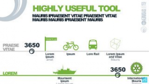
- Pick one main color, which you’ll use for most shapes, charts and diagrams on your slides. If your audience is all from one organization that has brand colors (like in their logo or website) – or if they don’t but you do – use a color from one of those sources. For instance, this deck by Presentation Studio uses green as the main color (based on their client’s corporate colors), as in this slide:
3. Also pick one contrasting color, so you can make key parts of your content stand out. For instance, you might color most bars in a chart the same shade of pale blue, but color one bar orange (so people focus on it). To see an example, check out this chart by Garr Reynolds (critiqued by Seth Godin) where Garr uses grey for most bars and red for just one of them.
And that’s it, our top three tips to bring your slides into the modern age! Take advantage of social media, reduce your text and increase the use of GOOD – not cheesy clip-art – visuals, and improve the use of color, and your presentation will deliver your message in a more modern and memorable way.